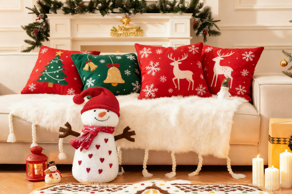
Struggling to make your holiday decor unique? The classic red and green combination can feel repetitive. It is time to find a fresh yet festive look for your home.
Red and green became Christmas colors because of a rich history. The tradition started with ancient pagans using holly plants in winter festivals. Later, cultural symbols and even modern advertising, like Coca-Cola's Santa Claus, helped make this complementary color pairing the holiday standard we know today.

I see the power of tradition in my work every day. As an OEM manufacturer, we produce thousands of red and green cushions, seat pads, and textiles for the holiday season. They are classics for a reason. But I also see a growing desire from brands and consumers for something different. They want their holiday decor to reflect a unique personal style. To innovate, we first need to understand the foundation. Let's look at where this tradition started.
Where Did the Traditional Red and Green Pairing Come From?
Does the history of Christmas colors seem a bit mysterious? You see red and green everywhere but might not know why. Understanding the origin helps us appreciate and reinvent the tradition.
The red and green Christmas tradition has deep roots. It mainly comes from the holly plant, which Celts used in winter solstice festivals to symbolize life. Early Christians adopted this, with green representing eternal life and red representing the blood of Christ. This history cemented the colors' holiday connection.

The story of these colors is a fascinating mix of nature, religion, and marketing. It did not happen overnight. We can break down the main influences that made red and green the undisputed kings of Christmas. I find that when my clients understand this history, they feel more confident in how they use or adapt these colors in their product lines.
The Key Influences
- Pagan Roots: Long before Christmas, ancient cultures like the Celts celebrated the winter solstice. They used evergreen plants like holly and mistletoe to decorate their homes. The green leaves represented life's persistence through winter, and the red berries symbolized life and rebirth.
- Christian Symbolism: As Christianity spread, it often incorporated existing pagan traditions. The Holly plant was reinterpreted through a Christian lens. The green leaves came to symbolize the eternal life offered by Jesus, while the sharp leaves represented the crown of thorns, and the red berries symbolized his blood.
- Victorian Era Popularity: The colors gained huge popularity in the 19th century. Christmas cards became a new trend, and many featured images of holly, red-breasted robins, and jolly Santas in red suits. This visual culture spread the color scheme widely.
- Modern Marketing: In the 1930s, Coca-Cola launched a massive advertising campaign. Their artist depicted a warm, friendly Santa Claus in a bright red suit, trimmed with white fur. This image became incredibly famous and permanently linked the color red with the modern idea of Christmas.
| Influence | Color Symbolism | Impact on Tradition |
|---|---|---|
| Pagan Traditions | Green: Life, Renewal | Established the use of holly in winter decor. |
| Christian Adoption | Red: Blood of Christ | Gave the colors deep religious meaning. |
| Victorian England | Red & Green: Festive Joy | Popularized the color scheme through cards. |
| Coca-Cola Ads | Red: Santa's Suit | Cemented red as the primary color for Santa. |
How Can You Modernize the Classic Red and Green Look?
Do you love the traditional colors but want a more sophisticated feel? Sticking to red and green can feel limiting. You worry your decor will look dated instead of elegant.
To modernize the classic Christmas palette, simply adjust the shades of the colors. Instead of bright, primary tones, choose a deeper, more muted version. For example, use a rich forest green as your main color and a deep burgundy or crimson as an accent for a vintage, elevated look.

I often advise clients who are developing new holiday textile collections to not abandon the classics entirely. Instead, they should refine them. A simple shift in tone can transform a product from ordinary to premium. This strategy allows a brand to appeal to traditionalists while also capturing the attention of customers seeking a more contemporary style. When we manufacture custom cushions or throws, this is one of the easiest yet most effective changes we can suggest. Let's explore how to make this work.
This approach is all about creating a mood. The bright red and Kelly green of our childhoods scream "excitement" and "fun." A darker palette feels more calm, luxurious, and thoughtful.
Creating a Refined Palette
To achieve this, focus on a clear color hierarchy. Don't let red and green fight for attention. Choose one to be the star.
- Dominant Color: Select one color to make up the majority of your design, around 70-80%. A deep, moody emerald or forest green works wonderfully as a base. It feels grounded and natural. You could use this for a large throw blanket, a set of placemats, or the main fabric of a decorative pillow.
- Accent Color: Use the other color as a supporting accent, making up about 20-30% of the design. A deep crimson or wine-red adds richness without overwhelming the senses. Think about using this for embroidery, piping on a cushion, or a subtle pattern within the fabric.
I remember working on a project for a European retailer. They wanted a "heritage" Christmas collection. We developed a line of seat pads using a dark hunter-green wool felt. Then, we added a simple, elegant deer silhouette embroidered in a deep burgundy thread. The product sold out completely because it felt both timeless and fresh.
What Are Some Unique Christmas Color Palettes?
Are you ready to move beyond red and green entirely? Using the same colors year after year can feel uninspired. You want your home textiles to make a bold, personal statement.
For a unique Christmas look, try pairing unexpected colors that still feel festive. Combine royal blue with a deep red for dramatic contrast. Or, mix a muted green with metallic gold for a touch of luxury. These alternative palettes can make your holiday decor feel fresh and modern.
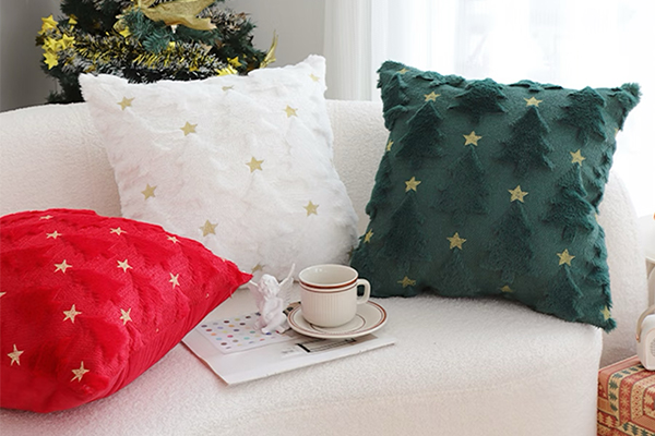
Breaking from tradition can be the most exciting part of product development. Many of the "secondary" colors we see in holiday prints can become the main event. By reducing or removing the classic red and green, the entire feel of a product line changes. It becomes more distinctive and memorable. I've worked with many brands to develop these kinds of eye-catching combinations for their custom cushion, pet bed, and toy collections. Let's look at some specific ideas that we've seen succeed in the market.
These palettes work because they tap into different aspects of the holiday spirit—from winter's cool beauty to the warmth of a fireplace.
Fresh Color Combinations for a Modern Holiday
| Palette | Mood & Feeling | Best For | Application Idea |
|---|---|---|---|
| Royal Blue + Date Red | Dramatic, Strong, Confident | Creating a bold visual statement. | A plush royal blue velvet pillow with subtle deep red piping or tassels. |
| Forest Green + Gold | Luxurious, Elegant, Natural | Adding a touch of sophisticated glamour. | A set of placemats in a deep green linen with a simple embroidered gold star. |
| Bright White + Cherry Red | Clean, Minimalist, Cheerful | Scandinavian or modern minimalist interiors. | A crisp white cotton blanket with a simple, repeating red reindeer pattern. |
| Charcoal Black + Crimson Red | Moody, Chic, Grounded | Creating a cozy and intimate atmosphere. | Charcoal gray seat pads for dining chairs, paired with a crimson red table runner. |
| Burnt Orange + Slate Gray | Warm, Earthy, Balanced | Rustic or modern farmhouse styles. | A soft throw blanket with a gray and orange plaid pattern, evoking a cozy fireside feel. |
The key is to use colors that are already present in the holiday season, but in a new way. The blue of a winter sky, the gold of a shining star, or the orange of a crackling fire. By making these colors the focus, your decor instantly stands out.
Conclusion
Embracing new color palettes makes your holiday decor unique. Whether modernizing classic red and green or trying a bold new combination, your home textiles can truly shine and tell your story.
